-
Here is why Tottenham Hotspur changed its logo

Tottenham Hotspur has revealed a significant update to its logo as part of the club’s evolving identity for the remainder of the 2024/25 season.
The announcement was made on Monday, November 18, 2024, via the club’s official website, signaling a fresh direction for the North London team.
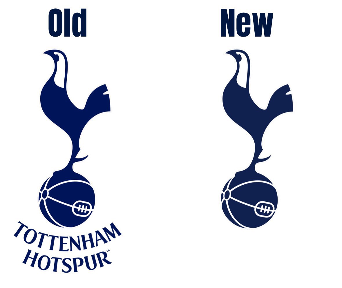
The new logo removes the curved “Tottenham Hotspur” text that previously appeared beneath the iconic cockerel. This marks a departure from the design introduced in 2013, which had been in use for over a decade.
Introducing the Club’s remastered brand identity, embracing our rich history and unmistakable heritage.
The cockerel reimagined. An icon reborn. Our font remastered.
To Dare Is To Do. 🤍
— Tottenham Hotspur (@SpursOfficial) November 18, 2024
Why the Change?
Explaining the decision, the club stated:
“We have removed the curved ‘Tottenham Hotspur’ text from beneath the cockerel. This enables us to increase its scale across different environments and stand proud as a true icon for the Club.”
This move reflects Tottenham’s focus on modernizing its branding to enhance visibility and recognition across various platforms.
The History of the Cockerel Emblem
The cockerel has been synonymous with Tottenham Hotspur for over a century. The club first featured the symbol on their badge in 1921 during the FA Cup final against Wolverhampton Wanderers. Spurs emerged victorious in that match, winning 1-0, cementing the cockerel as a lasting emblem of the club’s identity.
With this latest update, Tottenham joins the ranks of European clubs that periodically refine their logos to reflect their evolving brand and aspirations.
Introducing the Club’s remastered brand identity, embracing our rich history and unmistakable heritage.
The cockerel reimagined. An icon reborn. Our font remastered.
To Dare Is To Do. 🤍
— Tottenham Hotspur (@SpursOfficial) November 18, 2024

